


Colour defines the mood and personality of every kitchen. It shapes how a space feels, how light moves across surfaces, and how the design connects with the rest of the home. Choosing the right kitchen colour combination is therefore one of the most important steps in creating a space that feels both harmonious and timeless.
At Kaiser, colour is treated as more than decoration. Each palette is thoughtfully selected to complement cabinetry finishes, lighting, and layout, ensuring that the result feels balanced and refined. Whether you prefer soft neutrals, bold contrasts, or warm, welcoming tones, the right combination can completely transform your kitchen.
A carefully planned colour scheme brings style and comfort together, reflecting both the architecture of your home and your personal taste. With expert guidance from Kaiser’s design team, every detail is chosen to create a kitchen that feels cohesive, inviting, and beautifully individual.
Why kitchen colour combinations matter in design
Colour is at the heart of kitchen design. It influences how a space feels from the moment you step inside, shaping mood and atmosphere with subtle precision. The right kitchen colour combination can make a compact layout feel open and airy or add depth and warmth to a larger space.
Thoughtful palettes bring cabinetry, countertops, and flooring into harmony, enhancing both texture and proportion. A soft, neutral base may create an understated sense of calm, while a rich accent shade introduces character and definition. When chosen carefully, colour can unify the kitchen with adjoining living and dining areas, allowing the home to feel seamless and considered.
Kaiser’s design specialists use colour not only to decorate but to define — ensuring each kitchen feels elegant, cohesive, and perfectly attuned to the way you live.
How to choose the right kitchen colour scheme
Selecting the ideal kitchen palette begins with understanding your space and how you want it to feel. Colour is both expressive and functional, shaping everything from visual balance to how light interacts with your materials.
Reflect your personality and lifestyle
Your kitchen should reflect who you are. Homeowners drawn to vibrancy might favour bold shades such as deep blue or forest green, creating a space that feels energetic and expressive. Those who prefer calm, minimalist interiors may gravitate towards whites, greys, or warm neutrals that evoke a sense of order and serenity. The most successful designs feel authentic, blending personal style with daily life.
Consider your kitchen layout and size
Light colours such as cream, pale grey, or soft blue can make smaller kitchens appear more spacious and airy. In contrast, darker tones like navy, charcoal, or walnut can add depth and sophistication to larger layouts. Always consider how natural light enters the space, as it can dramatically influence how each shade appears throughout the day.
Think about your home’s flow
Kitchens rarely exist in isolation. A well-chosen colour scheme connects seamlessly with nearby dining or living spaces, maintaining visual consistency across the home. Using similar undertones or complementary shades ensures a sense of cohesion while allowing the kitchen to retain its own character.
Consult with a kitchen design expert
Working with a professional designer can make all the difference. Kaiser’s specialists help clients refine palettes, assess lighting, and choose finishes that complement both architecture and lifestyle. To discuss your ideas with a design expert, contact the Kaiser team and start planning your ideal kitchen colour scheme.

The psychology of kitchen colours
Colour influences not only how a kitchen looks but also how it feels. The psychology of colour explores how different tones affect our emotions and behaviour, and is a key consideration in spaces designed for both activity and relaxation. Understanding this connection helps homeowners choose palettes that support their lifestyle and reflect the atmosphere they wish to create. Learn more about this concept in Kaiser’s dedicated guide to colour psychology in kitchen design.
Warm tones
Reds, oranges, and soft yellows bring energy and warmth into the kitchen. These hues encourage conversation and sociability, making them ideal for family-oriented homes or spaces where people love to gather.
Cool tones
Blues and greens evoke calm and balance, creating a soothing backdrop that feels fresh and restorative. They work beautifully in open-plan layouts and modern interiors, where serenity and simplicity are key.
Neutrals
Whites, greys, and beiges offer timeless appeal. Their versatility allows them to pair effortlessly with almost any cabinetry or surface, providing a foundation of calm that feels both elegant and enduring.
Bold accents
Deep shades such as teal, plum, or charcoal can be introduced through a statement wall, splashback, or accessories. Used sparingly, bold accents add depth and individuality without overwhelming the space.
Kitchen wall colour combinations to consider
The relationship between wall colour and cabinetry defines the overall mood of a kitchen. Thoughtful combinations create balance and highlight architectural details, transforming a purely functional space into one that feels curated and cohesive. Explore more palette and material inspiration within Kaiser’s materials and colours collection.
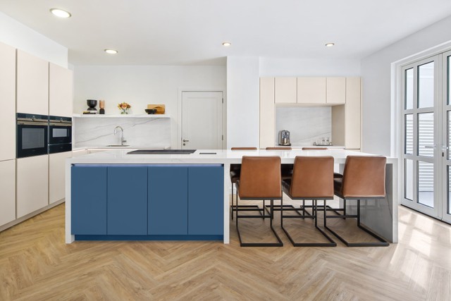
Classic light and dark contrasts
Combining white or ivory cabinetry with darker wall tones such as charcoal or navy creates a striking sense of balance. This contrast adds definition and visual interest, particularly in contemporary layouts where clean lines are key. It is a timeless choice that pairs sophistication with simplicity.
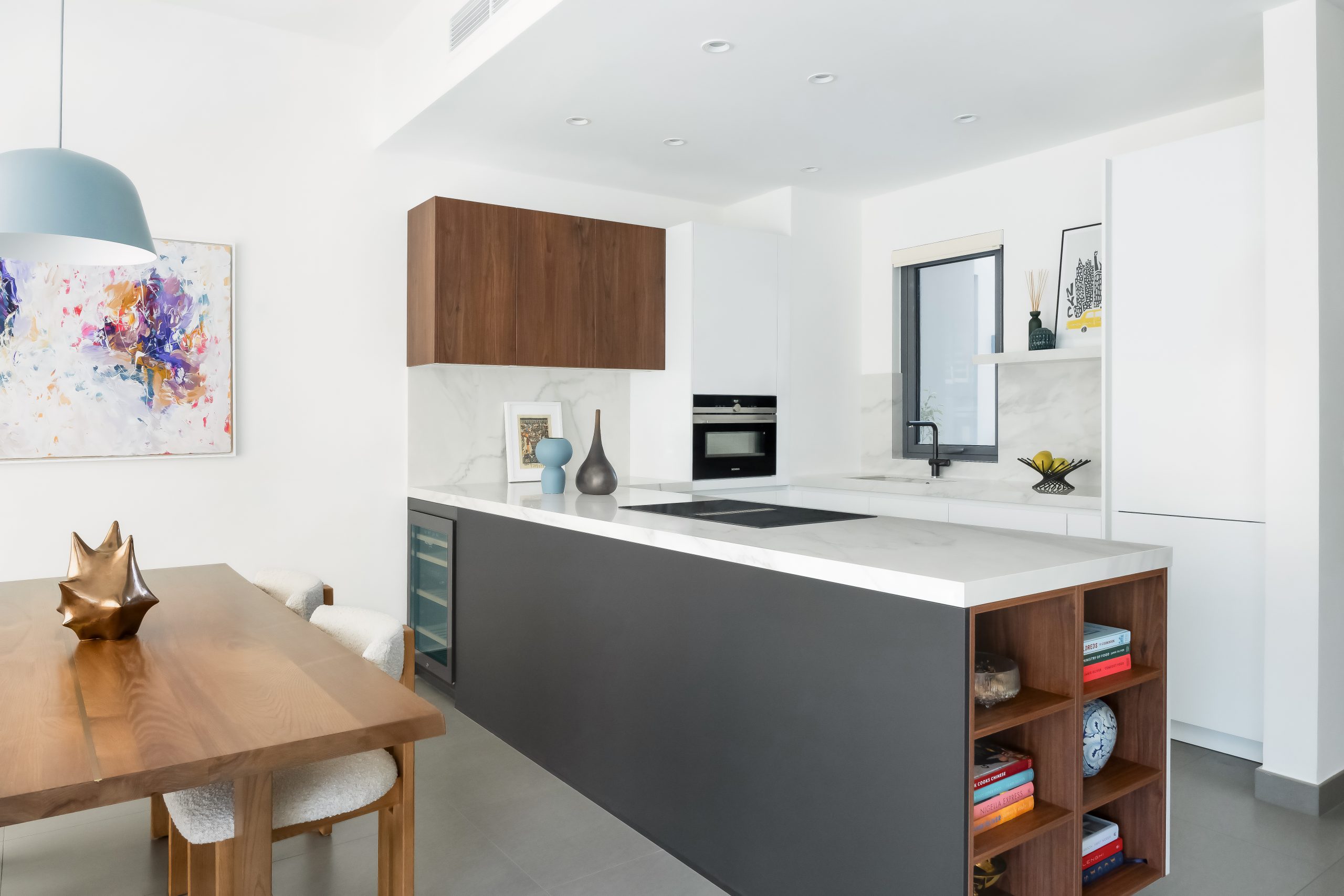
Refined neutral palettes
Warm greys, taupes, and beiges bring understated elegance to the kitchen. When paired with natural textures such as wood or stone, they create a sense of comfort and longevity. These palettes suit both modern apartments and traditional villas, offering harmony that never feels dated.
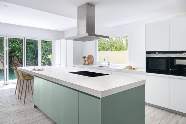
Bold statement walls
Introducing colour through a statement wall can instantly change the feel of a space. Deep greens, terracotta, or teal add personality while maintaining refinement. When balanced with neutral cabinetry and subtle lighting, these tones bring depth without overpowering the design.

Which colour is best for kitchens?
There is no single perfect kitchen colour, the best palette depends on the space, the amount of natural light, and the overall atmosphere you wish to create. The right combination enhances architectural features and complements the rest of your home, ensuring both beauty and functionality.
Light tones open up smaller kitchens, while contrast can bring definition to open layouts. Bold accents should be used selectively, adding personality without disturbing harmony.
Best light colours for kitchens in Dubai homes
Dubai’s bright natural light makes pale shades especially effective. Whites, soft creams, light greys, and muted blues reflect sunlight beautifully, creating a calm, airy feel. These tones are ideal for smaller kitchens or apartments where space and light are key considerations.
Balancing bold and neutral tones in your kitchen
A well-designed kitchen finds balance between impact and restraint. Bold tones such as navy or forest green can introduce depth and energy, while neutrals provide grounding and longevity. When combined thoughtfully, the result feels curated and intentional rather than overwhelming.
Finishing touches: accents and accessories
Details complete the palette. Handles, lighting fixtures, textiles, and small décor elements subtly enhance the overall colour scheme. These finishing touches allow for gentle variation or seasonal updates without altering the kitchen’s main design language.
Kaiser kitchens: find your perfect colour palette
A well-chosen colour palette is the foundation of every beautifully designed kitchen. The right combination of tones shapes atmosphere, enhances materials, and brings harmony to the space. At Kaiser, each project begins with understanding how colour interacts with light, architecture, and lifestyle to create something truly personal.
From timeless neutrals to bold contemporary contrasts, Kaiser’s design team helps clients craft kitchens that reflect individual taste and precision. Every palette is refined through expert consultation and paired with carefully selected materials to achieve balance, warmth, and elegance.
Explore more examples of colour pairings and finishes in Kaiser’s materials and colours collection and discover completed projects in the portfolio.
Discover your perfect kitchen colour scheme with Kaiser.
FAQs about kitchen colour schemes
What is the best kitchen colour combination?
There is no single best combination, but balanced contrasts often work beautifully. Pairing light cabinetry with darker accents or introducing subtle colour through a feature wall can create depth and character. The key is to choose tones that suit your home’s light, layout, and overall aesthetic.
What are timeless kitchen wall colour ideas?
Neutral palettes such as soft grey, ivory, and beige remain timeless because they adapt to changing trends. When combined with natural textures like wood or stone, these shades create a refined look that feels warm, elegant, and enduring.
What is the best light colour for a kitchen?
Whites and pale neutrals are ideal for kitchens, especially in Dubai’s bright climate. They reflect natural light, making spaces appear larger and more open. Subtle tints of blue or green can also add freshness without compromising simplicity.
Which colour is best for a small kitchen?
Lighter tones work best in compact kitchens as they visually expand the space. Pairing pale walls with light cabinetry and mirrored or metallic finishes helps enhance brightness while maintaining a clean, cohesive feel.
How do I choose a kitchen wall colour combination that feels balanced?
Start with a neutral foundation, then layer in one or two complementary tones. Add subtle contrast through worktops, splashbacks, or accessories. For a truly polished result, seek guidance from a design expert who can help you find the perfect balance between tone, texture, and light.
Begin your kitchen design journey with Kaiser
Every beautiful kitchen begins with a vision — and at Kaiser, that vision is brought to life through expertise, precision, and an eye for detail. Whether you are starting from a blank canvas or reimagining your current space, our designers help you refine your colour palette and create a kitchen that feels perfectly tailored to your home.
From soft neutrals to bold contrasts, each palette is developed with care to ensure it complements your lifestyle and architecture. The result is a kitchen that not only looks exquisite but feels effortlessly cohesive in every light and season.
Visit our showroom today to begin exploring your ideal kitchen colour scheme with Kaiser. Contact us to start your design journey.


